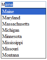
JavaScript Tutorials Advanced Creating an Autosuggest Textbox with JavaScript, Part 2In the first part of this series, you learned how to create type ahead functionality in a textbox, which presents the user with a single suggestion for what they've already typed. This article builds upon that functionality by adding a dropdown list of multiple suggestions. To do so, you'll extend the autosuggest control and suggestion provider class definitions. Creating the Dropdown ListThe dropdown suggestion list is nothing more than an absolutely-positioned <div/> containing several other <div/>s. It's placed directly under the textbox to create the appearance of a dropdown menu (see the image below).
The HTML for the suggestion list in the image above looks like this: <div class="suggestions"> Of course, some CSS is needed to make the dropdown list function properly. The outermost <div/> has a class of "suggestions," which is defined as: div.suggestions { The first two lines of this CSS class are for browsers that support two forms of box sizing: content box and border box (for more information, read http://www.quirksmode.org/css/box.html). In quirks mode, Internet Explorer defaults to border box; in standards mode, IE defaults to content box. Most other DOM-compliant browsers (Mozilla, Opera, and Safari) default to content box, meaning that there is a difference in how the <div/> will be rendered among browsers. To provide for this, the first two lines of the CSS class set specific properties to border box. The first line, -moz-box-sizing, is Mozilla-specific and used for older Mozilla browsers; the second line is for browsers that support the official CSS3 box-sizing property. Assuming that you use quirks mode in your page, this class will work just fine (if you use standards mode, simply remove these first two lines). For the other two lines of the suggestions CSS class, simply add a border and specify that the <div/> is absolutely positioned. Next, a little bit of formatting is need for the dropdown list items: div.suggestions div { The first line specifies the default cursor (the arrow) to be displayed when the mouse is over an item in the dropdown list. Without this, the cursor would display as the caret, which is the normal cursor for textboxes and Web pages in general. The user needs to realize that the dropdown item is not a part of the regular page flow and changing the cursor helps define that. The second line simply applies some padding to the item (which you can modify as you wish). Lastly, some CSS is needed to format the currently selected item in the dropdown list. When an item is selected, the background will be changed to blue and the color will be changed to white. This provides a basic highlight that is typically used in dropdown menus. Here's the code: div.suggestions div.current { Now that you understand how the dropdown list will be built, it's time to begin scripting it. Scripting the Dropdown ListCreating the DOM representation for the dropdown list is a multi-stage process. First, a property is needed to store the <div/> because various methods of the AutoSuggestControl need access to it. This property is called layer and is initially set to null: function AutoSuggestControl(oTextbox, oProvider) { The layer and the other parts of the dropdown list DOM will be created after you define a few simple methods to help control its behavior. The simplest method is hideSuggestions(), which hides the dropdown list after it has been shown: AutoSuggestControl.prototype.hideSuggestions = function () { Next, a method is needed for highlighting the current suggestion in the dropdown list. The highlightSuggestion() method accepts a single argument, which is the <div/> element containing the current suggestion. This method's purpose is to set the <div/>'s class attribute to "current" on the current suggestion and clear the class attribute on all others in the list. Doing so provides a highlighting effect on the dropdown list similar to the regular form controls. The algorithm is quite simple: iterate through the child nodes of the layer. If the child node is equal to the node that was passed in, set the class to "current," otherwise clear the class attribute by setting it to an empty string: AutoSuggestControl.prototype.highlightSuggestion = function (oSuggestionNode) { With these two methods defined, it's time to create the dropdown list <div/>. The createDropDown() method creates the outermost <div/> and defines the event handlers for the dropdown list. To create the <div/>, use the createElement() method and then assign the various styling properties: AutoSuggestControl.prototype.createDropDown = function () { this.layer = document.createElement("div"); The code above first creates the <div/> and assigns it to the layer property. From there, the className (equivalent to the class attribute) is set to "suggestions", as is needed for the CSS to work properly. The next line hides the layer, since it should be invisible initially. Then, the width of the layer is set equal to the width of the textbox by using the textbox's offsetWidth property (this is optional dependent on your individual needs). The very last line adds the layer to the document. The next step is to assign the event handlers.
|